
Rockwood Inn
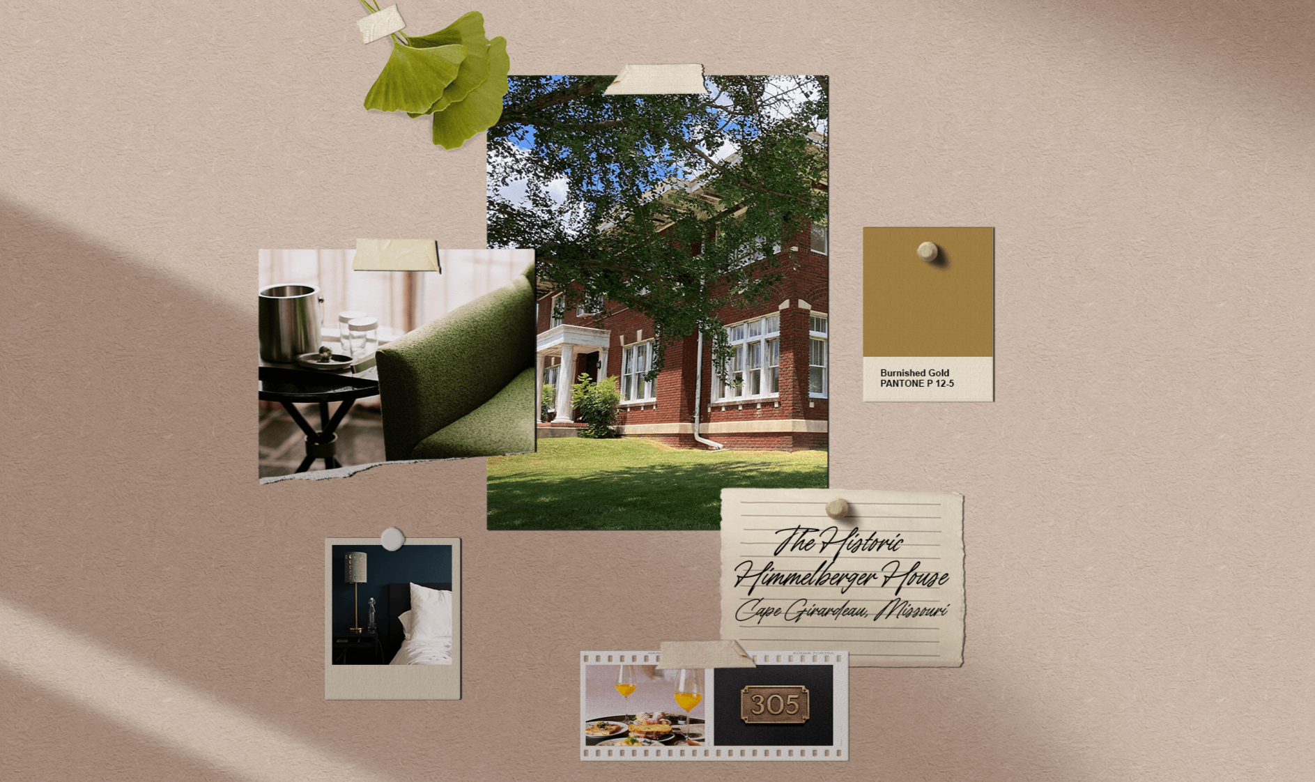
Project OverviewRockwood Inn is a boutique hotel located in the heart of Cape Girardeau, Missouri. Housed within the historic Himmelberger House—a landmark originally built in the 1920s—the inn blends timeless architecture with modern hospitality to create a distinctive guest experience.
The goal of the project was to develop an elevated brand identity inspired by the elegance and sophistication of the Roaring Twenties while remaining approachable, memorable, and rooted in the property's unique history.
The ChallengeAs a newly established boutique hotel, Rockwood Inn needed a brand that felt both luxurious and authentic.
Many hospitality brands rely on generic symbols of luxury, resulting in identities that feel interchangeable and disconnected from the places they represent. For Rockwood Inn, the opportunity was to create something more meaningful—an identity that reflected the character of the historic property itself.
The challenge was to balance:
historic influence with contemporary appeal
sophistication with warmth
local character with a premium guest experience
Most importantly, the brand needed to feel uniquely tied to the inn rather than simply inspired by a design trend.

The Clarity Shift
Rather than building the brand around a generic interpretation of Art Deco or 1920s aesthetics, the creative direction began with the property itself.
The most compelling details were already there.
The historic brickwork, original architectural elements, vintage-inspired wallpapers, chair fabrics, and the iconic gingko tree that stands on the front lawn all became sources of inspiration for the identity system.
This approach allowed the brand to feel deeply connected to the guest experience and the physical environment of the inn.
Instead of recreating the 1920s, the goal became capturing its spirit through thoughtful details and modern execution.
The branding moved away from steroetypical design and toward thoughtful elements from the hotel.
Brand DirectionThe visual identity draws inspiration from the elegance, craftsmanship, and refinement associated with the Roaring Twenties while remaining approachable and contemporary.
The gingko tree became a central brand element, serving as both a visual symbol and a connection to the property's landscape and history.
The broader identity was informed by:
historic architectural details
vintage wallpapers and interior finishes
textured brickwork
classic hospitality aesthetics
Art Deco-inspired forms and composition
Together, these elements created a brand that feels timeless, elevated, and uniquely rooted in place.
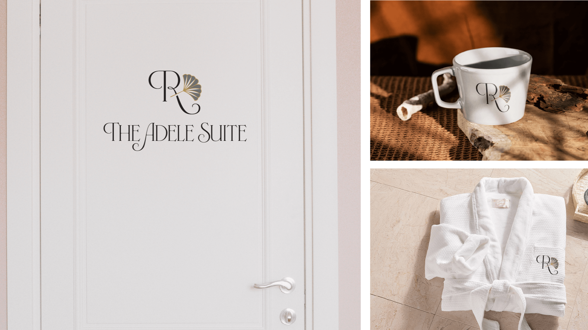
Final OutcomeThe result is a boutique hospitality brand that honors the history of the Himmelberger House while positioning Rockwood Inn as a refined destination for modern travelers.
By drawing inspiration directly from the property's architecture, materials, and surrounding environment, the identity feels authentic rather than decorative.
The finished brand captures the elegance of the 1920s, the character of the building, and the welcoming experience guests can expect from their stay—creating a foundation that can support the inn's growth for years to come.